

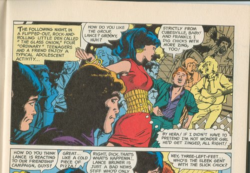
So, I'm going through what I lovingly call my Roy Harper comics and came across this bit of incongruity. Coloring revisions in "Punish Not My Evil Son." The first excerpt is from the original book, The Brave and the Bold 83. Note that Donna is wearing a white dress and Lance is wearing a shirt and vest, both in obnoxious shades of green to not match his orangey pants.
The second excerpt, of the same panel, is from The Best of the Brave and the Bold 6, on the better quality Baxter paper, I guess. Donna is now wearing a 2-color dress, red with a garish yellow middle that perhaps is supposed to now be a belt, instead of the tight knit it appears to be in the original. And Lance is now wearing a greenish suit with a purple shirt, both a more formal, non-teen-like outfit, and an even uglier color combination than the original.
I've seen this sort of thing done often, in this case and in others. I can understand if it's an improvement, but here it clearly isn't, though it does make Donna stand out even more. And yet, in the original, Dick, Wally, and Roy on the left, are in muted colors, making Donna and Lance stand out. In the revision, Dick and uh, Wally, I think it is, are fully colored, with Roy in blue shadows, and the panel doesn't feel properly blanced. I dunno. Maybe it's just me.
Gonna go find nice Roy shots to scan.

Oops, I meant to comment on this a week ago! But you and I live in the same city, and you know what it's been like here over the past week...
ReplyDeleteAnyway...no, it's not just you. Coloring changes in reprints always bother me from the perspective that the color really is part of the original presentation, and has a big impact on how the art was viewed at the time. Treating it like an afterthought and making arbitrary radical changes diminishes the sense of history for a new reader. It's another matter to correct mistakes, like reversed printing plates that made people's skin blue and the sky orange...or for original colorists to fix up things that they wanted to do in the first place but couldn't, as we see in "Absolute" editions of books like Watchmen or Sandman.
One thing about the color in older comics is that these guys were craftsmen (I say "guys" even though many of the most prominent colorists have been women; I'm pretty sure the colorist on this comic would have been a man, but I'm prepared to be corrected on this) and understood the mechanics of the printing process and the paper stock the pages would be on. They knew how to get subtle effects because of this technical knowledge. But for all that they were "just doing a job" there are still clever artistic choices and an aesthetic sense being brought to that job. In the original panel, the colors suggest the "freaky light show" atmosphere inside the rock club, and the orange of the foreground faces actually seems a bit more realistic in that setting...as well as giving us a cue that, although those heads are in the foreground, they're not meant to be the focus of attention. The eye is drawn to Donna and Lance as it should be. The white dress on Donna seems like an acknowledgement of her link to Wonder Woman, who was in her "white pantsuit" phase at the time, so that's a bit of artistic subtlety letting you know who she is even without the costume. (And yes, white dresses were popular back then, children. Us old folks wouldn't lie, would we Shelly?)
In the recolored version...the eye isn't led to the important element in the panel, the atmosphere of the rock club light show is totally lost (that taupe color plane the drummer is in looks especially wrong) and Donna has dress colors chosen to indicate her superhero garb...not especially plausible if she's supposed to be incognito, and thuddingly unsubtle compared to the original. The colors seem really oversaturated on the Baxter paper, which was a big problem in the Eighties when colorists didn't have a lot of experience knowing how differently the paper would receive the ink and everything came out looking too garish. You see the same thing in the Kirby New Gods reprint series from the same era.
Pretty longwinded way to say "I agree" -- I hope it was worth the wait!
Longwinded but worth it, Rab, and yes, it's been a long, hot week here. And yes, we older folks would never lie. :)
ReplyDeleteI went back to look at the books. I didn't see a colorist for the original listed, just art credit to Haney. I know there were one or 2 women who did most of the coloring on DC's superhero books back then, but there were a couple of men, too, as I recall, so it's a tossup as to who colored it.
The colorist on the Baxter reprint is Petra Scorsese or some such spelling. I just put the book away and don't feel like pulling it out again. At any rate, Petra is usually a woman's name.
Your analysis of the subtlety of color in comics yields good points. Color is as much a part of the art as the lines are.
I've sold off a lot of original books when I get the reprints, such as the GL/GA books. But this is one original I won't part with due to the art. The original may be faded, but it's superior art-wise all the way.