This article She Has No Head - No, It's Not Equal by Kelly Thompson is awesome and the comments make wonderful points. There were, when I looked, 531 comments, so no, I didn't read all of them. The article was written back in February and I somehow missed it, but saw a link to it on Tumblr and was happy to find it.
I've never had a problem with sexy art. It's the fact that it isn't equal that bugs me. And I, too, hate the "brokeback" posing of the female characters (and that term gives me the giggles because whenever I see it, I think of the movie Brokeback Mountain). I also hate seeing the female supers in thongs with their asses hanging out because that just looks so uncomfortable. Thompson's right about the unzipped zipper phenomenon. Once or twice, it's kind of fun, a bit kinky, a bit playful. All over comics.... not so much. It's ridiculous.
I'm not overly fond of the males with torsos the sizes of mountains, either. Wanna know what my idealized male fantasy looks like? See Magic Mike. Every one of those guys is sexy in his own way and, aside from being in good shape, they don't all have the same body type.
But, as Thompson says, so much better than I can, even sexy isn't evenly drawn in comics, and more and more, I find things to dislike in the art. When the male form is drawn athletic and powerful and the female is drawn to titillate, then there's a real disconnect somewhere. Half the time I can't follow the action because the coloring is so dark and what I do see, if there are females in the panel, are butts and boobs. And it's doubly annoying when the art is otherwise nice. Surely, the artists can do better, and the editors, and the publishers, and we readers need to do better, too. But, do I not buy a comic I love for the story to protest the art? And what about all the comics I'm not reading because I hate the bulk of the new DC52? I can't boycott them twice. And there's the dilemma of wanting to support female-oriented books vs boycotting poorly done female-oriented books. How to make two nearly opposite points at once? That's a dilemma I shouldn't have, not in 2012.

Showing posts with label art. Show all posts
Showing posts with label art. Show all posts
Tuesday, July 17, 2012
Thursday, January 12, 2012
Full of Awesome
These animated comic book covers are amazing. So clever and well done. I followed a bunch of links to get to the source and forgot to leave bread crumbs to mark the trail. Sorry. But thanks to all who posted about these.
Wednesday, November 17, 2010
Photo Post

If ever there was doubt Amy Reeder would be an excellent choice to draw this book, this should dispel it. Kara looks lovely. I didn't get the variant cover. Actually, I didn't know about it until I saw the credits inside on my ride home, so I checked it online and it's wonderful. But this cover rocks, too. The story started off great and it looks like Gates is determined to go out with a bang. There's just so much going on, and the toys are creepy, as creepy as clowns. Igle and Sibal's art is wonderful. Igle draws wonderful expressions, more realistic than Amanda Conner's but with the same level of emotion.

Wednesday, November 07, 2007
Where are the Panties?

Quite the haul today, thanks to the latest Modesty Blaise collection and the Heroes hardcover I've been eagerly lusting after and finally own. However, while there was much to enjoy in today's batch of regular comics (and reviews will appear soonish), including the latest Criminal which ends the second arc, there was uh, well, see for yourself.

Now, I basically liked the art on Supergirl this time. The skirt on her costume didn't look like a long belt. But, but, but... well, look at her. This was just one of several shots of her about to lift off, one leg raised, revealing... well, no sign of panties, that's for sure. And it is still a bit low at the top, barely staying on her hips.
I don't have a problem with sexy art. I like Ed Benes' work, after all. I do have problems when teen characters are sexed or tarted up and I do have a problem with anatomically incorrect characters, but sometimes, well, there really is no excuse, especially when the art is otherwise fine, to peek under the skirt of a teen girl who has been established to be under the age of consent. And while nothing anatomical was on display, other than upper thigh, more or less, there was certainly enough shown to indicate no underwear. So, either drape the skirt better or show panties. Neither can be all that difficult to draw.
I might have considered that the skirt was just long enough to make it unclear, in that the panties were a bit higher than shown, except for the way Kara's leg is curving and for the number of such shots designed to reveal what's under her skirt.
I'll get to the content later, because, really, I need to time to decide if it was me or the story, but it made no sense, even for an opening chapter.

Saturday, June 02, 2007
Feminist Issues
I'm about to be long-winded. Deal with it, read it, comment, or just move along. ;)
While I was away, a lot of the comics blog posts I read had to do with a certain cover to a certain comic I don't read. Coming right after the MJ statue controversy, it's been a busy time for feminist bloggers, fanboys, and everyone else who enjoys an online ruckus. I would have more to say on the topic if I was more familiar with both Spider-Man comics and Heroes for Hire. But as I have just general knowledge of the former (never read the comics, did sometimes read the newspaper dailies, did see the first movie) and no knowledge of the latter (beyond seeing listings for it in CSN), I'll just post some general observations and opinions.
First, Kalinara linked to a nice defense/explanation of the H4H cover. Well worth reading for how to react to a controversy. The official and unofficial defenses that I read over the last week didn't cut it.
If someone is offended, then a thing is offensive on some level, as Kalinara explained previously. Saying it can't be offensive because no intent to offend existed is to avoid the issue.
Not everyone will be offended by the same things. Same as not everyone will like the same things. If I think Hemingway is a boring, annoying writer (which I do), does that mean he's a boring, annoying writer? Depends on who you ask. Artforms are like that. Sometimes, it's helpful to turn the argument around to something opposite to see how ridiculous some defenses can get.
I think better than saying the work is offensive can be "the work offended." Or that some people found the work offensive. The work exists on its own merits, but because it's an artform, its qualities are subjective. Offense is subjective. The more people who find something offensive, the more offensive it is. The audience ends up defining the work.
Bigotry works like that. Biases are everywhere. Stop a black man on a street for a random check without cause, but not the white men, that's bigotry. Stop the black man because you're looking for a mugger described as a black man wearing similar clothes, there likely isn't bigotry, unless you unnecessarily rough him up. Stop all men, regardless of ethnicity or race, and you probably aren't displaying bigotry, either. Context is usually everything. And no, I tend to not deal in absolutes, because I've learned in my 54 years (and counting), that exceptions can be found for just about everything.
My brand of feminism, as I believe I've stated here before, is about self-determination. It's about equality. Equal rights. Equal opportunities. Equal chances to fail as well as to succeed. Many years ago, I read a wonderful quote (I forget from who, but he was an education official, I think) that had to do with the concept that equality won't be achieved when the top people all have equal opportunities, but when the mediocre ones and those below that do. I agree with him. Equality will be achieved when ethnicity, religion, race, and sex will cease to be factors determining opportunities. Only abilities will.
Exploitation is something else. Is it exploitation when someone willingly allows it? When they control it by going into what's been labeled exploitive situations/jobs? Is someone above the age of consent being exploited or exploitive when they choose to sell their bodies? Is it demeaning if you don't feel demeaned? I would certainly not make the choices others do. Sure, prostitution is an extreme example, but how about something less obvious? Librarianship. The traditional domain of women (straight and gay) and gay men. Where, when I was in library school anyway, straight men were looked at funny when they wanted to be a librarian. Like male nurses. Did I settle for something I was programmed to be or did I become something I truly enjoy being? We all make choices based on upbringing, cultural influences, and our own minds.
What does this have to do with comics? Why am I posting it here instead of on my more political blog? Because the issue is pervasive in comics. And it is that way because comics have long been in the control of men, some of whom get women and some of whom don't. Which isn't to say women creators are all made of the same cloth, either. But in large part, men make the decisions, even if a woman ran DC Comics for a long time prior to Paul Levitz succeeding her. It affects how females are portrayed and how they are viewed.
One more thing before I get to the specifics here. I'm also a believer in Wittgenstein's concept of... well, concepts. That there are core concepts just about everyone will agree to and then nebulous, movable borders to those concepts that are placed differently for each person. So, we all might agree that shooting someone in cold blood is murder, but we might disagree that euthanasia is murder.
So, specifics. The MJ statue. Who hasn't seen a pic of it by now? Is it offensive? I dunno. I wasn't offended by it. I thought it was ridiculous looking and a poor reproduction of the sexy illo it was based on. It looked painful for MJ to be bent over that way. But I also thought it was a poorly executed attempt at a playful poke at a traditional and outmoded image of women, whether or not that was the intent. I don't deny that people were offended and anyone who mocked them for it missed the point.
The Heroes for Hire cover. Again, I didn't see it as offensive. I do agree the expressions made them look fearful, not a positive image, to be sure. I had no problem with the placement of the tentacles. More on that in a bit. Lea Hernandez reworked the cover on her LJ. She also posted this interesting letter from a retailer.
Re: the reworked cover. First, I don't think the middle woman looked all that frightened. More calculated, like she was biding her time before she could act. Anyway, in the reworked version, they look eager. I commented that they looked eager for the tentacles to attack them. Now, I'm a literal-minded person. I take what I'm given. If I infer something, it's got to be really clear. I didn't infer that they were eager to kill the tentacle creature, because that really isn't in the picture. What interested me was the comment my comment that they looked like they were enjoying it got: better to enjoy than to cower in fear... Yeah, right. That's so much better. Gonna rape me? Bring it on! I love being raped! Yeah, that works. NOT.
I don't get the whole tentacle porn/rape imagery in that. I'm a literal-minded person, mostly. I didn't see it, but that doesn't mean others didn't. They did, so on some level, it's there, intended or not. Lea changed hair and such, because it wasn't realistic. Heck, these are comic characters who, I presume have superpowers? Why would they be realistic? But I digress. I would never blame the artist, who worked freelance, I believe, according to specs she was given and her own cultural mores. Marvel bought it. Marvel didn't return it to be reworked. If that's the image Marvel liked, that's where the complaint should lie. And it wasn't nearly as suggestive or exploitive as many other covers on mainstream or non-porn books in comics shops.
Covers (see, I am getting to that) generally fall, as I see it, into one of two major categories: Heroic and Jeopardy. The more dangerous the situation, the more dire, the more eager we readers should be to see how the heroes get out of trouble. And for women (though it would work for men, too), rape is viewed as very dire, indeed. It's sure not on my list of things to experience (<-- Note of sarcasm here.) So, while the expressions could've been improved, I'd have made them look angry.
From another cover in recent months: Star Sapphire ready to stomp Hal/Green Lantern = Hero in jeopardy! Star Sapphire wearing the skimpiest costume in history for her negates the image somewhat because it detracts from her ability to pose a legit threat and therefore is viewed by many to be exploitive. The story rose above it.
Unfortunately, I don't know H4H, so I can't know if my "improvement" for it would make sense. But I would swap out one of the females for a male. Make things more equal.
Where do I sit in this controversy? Probably somewhere in the middle. I'm not all hot and bothered by the art in both the cover issue or the MJ statue. I don't think they're evil or misogynistic, nor do I think they're all that exploitive, though they do cater to a certain audience. But that's how marketing works. Doesn't make it right, not when companies claim they want to expand their audience and definitely not when they want to appeal to more females. Sad, but they don't seem to grasp how to do that, though I'm hoping DC's Minx line helps. But getting females reading superhero comics should be a goal, too, because right now, comics are losing out to other media and bringing in female readers can improve the bottom line.
The dialogue these controversies have generated can be good if the creators and the publishers pay attention. The goal is to keep print comics viable (at least through my lifetime because I hate reading comics online because my eyes don't like it) because it is a wonderful media. I want to see it healthy and thriving. I want to see it appeal to everyone, young and old, boys and girls, men and women. I want people to think of comics and smile fondly. I don't want them to think of comics and frown or turn their nose down or make derogatory comments. Comics shouldn't be just for kids. The sooner the publishers realize they need to make some adjustments to bring this dream to reality, the better.
Okay, I rambled on long enough. This post. Maybe some other time, I'll post something about role models. But one thing I won't do here is claim any issue is simple or that it has one perfect solution, though in this case, more women editors and writers and more women who get to make the decisions couldn't hurt.
Sunday, April 29, 2007
Dear Anonymous
Dear Anonymous,
I have not published your comment on one of my review posts. I will not publish it (well, I did once by accident as my poor eye-hand coordination led me to click publish instead of reject, but I quickly deleted it forever) no matter how many times you try posting it. I didn't mention the art. You want to read reviews where the art is always mentioned, this isn't the place for it. I'm more likely to mention the art when I don't like it, and when I do like art, it's most because I like how the faces are drawn and not for some aspect of the artistic storytelling, since I am untrained in that and can't really tell when it's good or not. My main interest is that I can tell the characters apart and they look the way I want them to.
Also, I allow anonymous comments so people would be able to post a comment even if they don't have Blogger accounts. I do prefer, however, that they at least give a name or nickname somewhere.
Comments, here and on my other blogs that have comment moderation on, are published at my discretion. On the ones without moderation, they're left or deleted at my discretion. My blogs, my choice.
Thank you for your understanding,
Shelly's Comic Book Shelf Management
Sunday, March 18, 2007
Boobs on Boobs
Paperghost is my new hero. You've got to read the comments to Meltzer's post. Most folks on Brad Meltzer's MySpace don't have a problem with the cover from hell, aka PG's Breasts Attack! After all, most don't want to upset the man they go there to worship. One or two even wondered why all the protests were from men. Well, this woman is doing her protesting here and on other blogs because I'll be damned if I join MySpace just to comment in that thread or on any other of Brad's posts, even when I want to give him kudos. Which I did once and discovered I needed an account to do so. feh. I don't want a MySpace account.
Of course, the comments, mainly from one Randy, remind me of why I stopped visiting the DC Comics message boards. Randy's too dark user pic has a man, presumably him, holding a baby, which I hope isn't a girl or his, because he won't likely instill a proper sense of independence and empowerment in her judging by his comments in response to Paperghost.
Randy had this to say:
And it's sad that people don't get the real issue. They defend PG's large breasts, not understanding that it's fine for PG to have those giant melons. The problem is that they do not appear to be attached to her body except possibly by glue and in the wrong place. There are plenty of women endowed with enormous breasts who have generously shared nude photos of themselves online. Of course, that won't help artists like Turner who would then need to figure out how high the lift when the breasts are stuffed into spandex which presumably has a built-in bra, probably with an underwire, or else they would likely hang to her waist or lower.
I've said many times here that I don't mind cheesecake provided I get to see my share of beefcake. But same as I wouldn't like seeing a male character's package protruding from his abdomen, I'd prefer to see the females portrayed realistically. Male characters look silly in short pants, even when they are young like the original Robin, unlike females who have legs showing up to their ass. And that's fine. But when Wonder Woman, who is currently a dignified character (all silliness from the past is forgiven if not forgotten), has her ass sticking out of her bathing suit style outfit when normally, the pantyline comes down a bit lower, I call that gratuitous. There is no comparable display of male anatomy to make this fair or reasonable.
I don't want to be rabid here. I like sexy art, and normally, I don't mind a little extra flash of skin. But it's getting to be ridiculous and yes, demeaning, when it's so poorly executed, is unfairly and unevenly distributed between the sexes, and comes when DC, especially Don DiDio, is wondering how to reach more female readers. Covers like that JLA 10 isn't the way.
Oh, and Paperghost provided a link to this wonderful analysis of the anatomical impossibility that is PG on that cover.
Of course, the comments, mainly from one Randy, remind me of why I stopped visiting the DC Comics message boards. Randy's too dark user pic has a man, presumably him, holding a baby, which I hope isn't a girl or his, because he won't likely instill a proper sense of independence and empowerment in her judging by his comments in response to Paperghost.
Randy had this to say:
"See, whereas you're looking at Wonder Woman's ass, Power Girl's boobs and Supergirl's mid-section, there are some readers like myself who prefer to ignore that sort of stuff to watch Wonder Woman rescue abused women (Wonder Woman #5) or Power Girl recruit new members of a team she believes in (JSofA #1) or Supergirl try to figure out her place in the world (Supergirl #12)"Wow. Someone who reads comics just for the words, is that what we're to believe? Sheesh. As Paperghost asks:
"Would you see Superman drawn with his Supernuts hanging out?"When the discussion ends up in a laughable debate as to whether or not the art is good (the fact that it's anatomically awful is viewed as a subjective opinion by some of these people) among the other issues under discussion, then I'm doubly glad I'm not on MySpace.
And it's sad that people don't get the real issue. They defend PG's large breasts, not understanding that it's fine for PG to have those giant melons. The problem is that they do not appear to be attached to her body except possibly by glue and in the wrong place. There are plenty of women endowed with enormous breasts who have generously shared nude photos of themselves online. Of course, that won't help artists like Turner who would then need to figure out how high the lift when the breasts are stuffed into spandex which presumably has a built-in bra, probably with an underwire, or else they would likely hang to her waist or lower.
I've said many times here that I don't mind cheesecake provided I get to see my share of beefcake. But same as I wouldn't like seeing a male character's package protruding from his abdomen, I'd prefer to see the females portrayed realistically. Male characters look silly in short pants, even when they are young like the original Robin, unlike females who have legs showing up to their ass. And that's fine. But when Wonder Woman, who is currently a dignified character (all silliness from the past is forgiven if not forgotten), has her ass sticking out of her bathing suit style outfit when normally, the pantyline comes down a bit lower, I call that gratuitous. There is no comparable display of male anatomy to make this fair or reasonable.
I don't want to be rabid here. I like sexy art, and normally, I don't mind a little extra flash of skin. But it's getting to be ridiculous and yes, demeaning, when it's so poorly executed, is unfairly and unevenly distributed between the sexes, and comes when DC, especially Don DiDio, is wondering how to reach more female readers. Covers like that JLA 10 isn't the way.
Oh, and Paperghost provided a link to this wonderful analysis of the anatomical impossibility that is PG on that cover.
Thursday, March 15, 2007
Random Bits
Now, I've never been a member of the Michael Turner can't draw humans bandwagon, even if many of his females look anorexic, but I've got to say that this cover for JLA 10 that Brad Meltzer is showing off on his MySpace really gave me a WTF? moment. I mean, is it really possible to push so much mammory gland tissue through an opening in a spandex top so as to form an actual, physical shelf Power Girl could probably use as a tray? Her boobs keep getting bigger and bigger like this, I'm gonna suspect tumors. I'd hate to be her when she has to get a mammogram. Oh, right. She's super and probably can't get cancer, so it's not an issue. sheesh. The thing that really bugs me is that she wasn't created with such huge breasts. Nice and full, but not abnormal like these things.
Spoilerage. So much has been said all over the comics blogosphere about spoilers in wake of the Captain America death (is there anyone who hasn't seen the news?) that, despite never having read any comic that included him, I have to say there was some good that came out of the controversy. I now know the Cap's name was Steve Rogers. More seriously, I've thought about this and while I hate having things spoiled for me, unless I seek out the spoilers, I think there are degrees of spoilerage. I will now outline mine.
Not for me:
Fill-in issues are, well, fill-in issues. Will Pfeifer is a good writer and he writes credible, strong female characters, including Catwoman, but it seems even he can't make a fill-in any more than a fill-in. Sure, Wonder Woman 5 is a nice story about female empowerment, which given the lateness of the Wonder Woman comics the last few months, landed it directly in Women's History Month. But Wonder Woman is a larger than life character, from the gods, one of the big three, so the story seemed kinda ordinary. And given the first story hasn't yet been completed, it seems out of place, too. Just can't disguise a story that was stuck into a tight spot like that, but kudos to Pfeifer for producing something readable, and even moving, even if the excuse to get Diana to the shelter was seriously lame.
There are thousands upon thousands of names in the world, so why are there so many Kates / Katherines / Katarinas / etc. in the DCU? For that matter, we had Jade as the codename for a superhero and the real name of Cheshire. We've got Cassandra Cain and Cassie/Wonder Girl. I'm sure there are others. I think they repeat names just to confuse me.
~~~o0o~~~
Spoilerage. So much has been said all over the comics blogosphere about spoilers in wake of the Captain America death (is there anyone who hasn't seen the news?) that, despite never having read any comic that included him, I have to say there was some good that came out of the controversy. I now know the Cap's name was Steve Rogers. More seriously, I've thought about this and while I hate having things spoiled for me, unless I seek out the spoilers, I think there are degrees of spoilerage. I will now outline mine.
Not for me:
- Spoilers that hit you in the face before you even know they're coming. Hey, give me a warning so I can avoid the thing if I want. It's hard when it's in the newspapers and on the local newscasts, along with blog and website headlines.
- Revealing reviews without spoiler space. Pretty much making sure I'll never read your blog again, eh?
- Covers that reveal too much. Recent examples include Ted "Blue Beetle" Kord on Manhunter and Supernova revealed as the supposedly dead Booster Gold on 52. For the first, we now know it was misdirection and not Ted at all, making it a neat bit of gotcha. In the second, it might've given away the secret, but there was still, for me, the whole, huh? how? why? really? questions going on, so I had to read the story to get the answers. Yeah, I missed the clues. I'm middle-aged, easily distracted, and forgetful. So sue me (an expression we "geezers" still use).
- Reviews with ample spoiler space. Cool. I haven't read the book yet, seen the movie, whatever. I'll come back when I do to see if we agree.
- Teasers. This refers to the tidbits Don DiDio has been handing out at cons and the posters that are now ads in DC's comics for the upcoming Countdown. I think they're fun, especially the clues being dropped nearly everywhere, including the books. It's fun to try to figure out what's going on, especially when I'm so lame at figuring out these things. Like, take 52, for instance. it supposedly means something. Now, I've pretty much figured it simply referred to the 52 weeks of the missing year between the pre-52 situation and the OYL titles. So I didn't pay all that much attention to anything that might remotely be a clue to something more. I was simply enjoying the story. Silly me.
~~~o0o~~~
Fill-in issues are, well, fill-in issues. Will Pfeifer is a good writer and he writes credible, strong female characters, including Catwoman, but it seems even he can't make a fill-in any more than a fill-in. Sure, Wonder Woman 5 is a nice story about female empowerment, which given the lateness of the Wonder Woman comics the last few months, landed it directly in Women's History Month. But Wonder Woman is a larger than life character, from the gods, one of the big three, so the story seemed kinda ordinary. And given the first story hasn't yet been completed, it seems out of place, too. Just can't disguise a story that was stuck into a tight spot like that, but kudos to Pfeifer for producing something readable, and even moving, even if the excuse to get Diana to the shelter was seriously lame.
~~~o0o~~~
There are thousands upon thousands of names in the world, so why are there so many Kates / Katherines / Katarinas / etc. in the DCU? For that matter, we had Jade as the codename for a superhero and the real name of Cheshire. We've got Cassandra Cain and Cassie/Wonder Girl. I'm sure there are others. I think they repeat names just to confuse me.
Wednesday, March 07, 2007
Separated at Birth?
 This is the reason I don't like the art currently on The Outsiders. I'm not liking the book all that much, but that's a different matter. It's not that the art by well, 2 people who alternated pages and since they don't actually number pages anymore in comics it seems, and I'm too lazy to count, I won't name the humans responsible. Which might be just as well.
There wasn't much of a problem in OYL with Capt. Boomerang, Jr on the team, given that Roy was now off it. So, there wasn't much if any likelihood of confusing the two characters. Which wasn't the case in the first OYL issue for me, since I didn't know Roy was really off the team til I read it.
For the record, that's Roy "Arsenal" Harper to the left. In the pic below, we see Capt. Boomerang, Jr. from the same issue. The hair style is different and Roy's got different face hair on his chin, but they both do have chin hair and both are redheads. And since the artists seem to utlize limited facial expressions, and use a fairly minimal/cartoonish style (this isn't ultra realism, folks), the two characters do look alike, especially at first glance, not counting the costume Roy's wearing and Boomer's prison orange and that weird collar thing.
 The story hasn't been all that bad, though we didn't get any more in this issue re: what leads Roy to quit (or be tossed off) the team, which is why I'm still reading the book. The storyline with Anissa's father, Jefferson "Black Lightning" Pierce going to prison for murder is actually interesting as it fills in a gap in continuity for the missing year. Mostly, though, the issue is devoted to Grace and Anissa's then-budding relationship. I imagine Roy would be interested to know Grace "has sex with men" and "relationships with women." Then again, when it came to Grace, Roy was interested in sex, not a relationship, either.
And yes, here I am talking about characters humans created and other humans have chronicled over many years. It's the fan person in me. The fangirl who wrote fanfic for her favorite tv shows as well as a few pieces about Roy Harper for the Titans APA. It is the ultimate compliment, I think, to a writer to take their creations as real on some level. Roy's been "real" to me since the mid-'60s when I developed a crush on him. As impossible as it sounds to have a crush on a two-dimensional creation, it happens all the time. So I find it a bit disturbing to see another character with a face so similar to his. And I like Boomer. I just wish he was drawn as a character in his own right and not a pale imitation of Roy.
Saturday, February 10, 2007
New Supergirl Artist
Okay, so this might not be as awful as I'd feared. I did not like Ale Garza's art on the Teen Titans/Outsiders Graduation Day. I thought Donna in particular looked ugly. But these sketches are pretty nice. He had this to say about Kara on his MySpace:
I know art really affects how a story "feels." I've not liked books with art I didn't like but others loved. What we need is for more people to like the art than not and to be willing to keep reading and let Kelly convince us he's got Kara on the right track. So, here's hoping Kelly and Garza are a perfect fit for each other and for Kara.
"so i thought id go into my new girl here...kara...that is...i know that there are a lot of fans out there who hold this character very near and dear to thier hearts...i just wanna go on and say i am one of you! honestly..."So, I'm remaining cautiously optimistic. I can forgive a lot more than many readers, apparently, so if I'm getting impatient, things must really be bad. heh. But I want Supergirl to succeed. I want any female superhero title to succeed. We have Wonder Woman who's been rebooted so often, my head spins. We have Birds of Prey which needs a group of women to succeed (and one brilliant writer to keep it going). We're losing Manhunter. Again. The DCU needs this book to do well and we all will benefit by its success because then, we might get more.
I know art really affects how a story "feels." I've not liked books with art I didn't like but others loved. What we need is for more people to like the art than not and to be willing to keep reading and let Kelly convince us he's got Kara on the right track. So, here's hoping Kelly and Garza are a perfect fit for each other and for Kara.
Friday, January 12, 2007
Now This is Fine
Turnabout is always fair play, especially when it comes to cheesecake and beefcake. Thanks to
Kalinara for the link.
Kalinara for the link.
Saturday, December 16, 2006
For the Record

For the record, in case I haven't yet blogged about it, because I don't recall, I think this cover stinks. Now, I have no problems with cheesecake, or as I've mentioned numerous times, beefcake, but there is no reason I can think of to dress her this way. I feel slimy just posting the pic here. I did consider merely linking to it, but I think bloggers should make things convenient for their readers whenever possible, so here it is.
It makes so much sense, right? to cover her arms and legs, but not 99 per cent of the rest of her. It won't take much to get this cover an x-rating. And for no reason. Color in the body and leave it form fitting and it's still a sexy outfit, albeit one that's decent and even beautiful. A contrasting color, perhaps.
There really is a difference between cheesecake that's fun and in the spirit of comics' heritage and cheesecake that borders on porn strictly to try to drum up sales from male readers who don't need much incentive anyway to buy comics.
I'm enjoying the Green Lantern series post-OYL, but this cover leaves me cold. It's just not the right image for a mainstream title. Plus, she looks anorexic, which is another image DC shouldn't want to convey.
Sunday, October 22, 2006
It's Batman
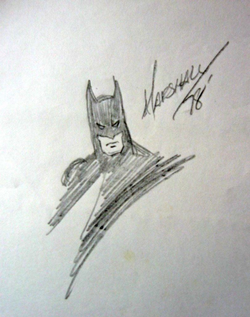
I was looking for something else and came upon this in my files, which I'd completely forgotten about, so I thought I'd share. I don't recall the comicon I was at when I got this, but as you can see, Marshall Rogers drew and signed it in 1978.

Saturday, July 22, 2006
Retconned Art

So, I'm going through what I lovingly call my Roy Harper comics and came across this bit of incongruity. Coloring revisions in "Punish Not My Evil Son." The first excerpt is from the original book, The Brave and the Bold 83. Note that Donna is wearing a white dress and Lance is wearing a shirt and vest, both in obnoxious shades of green to not match his orangey pants.
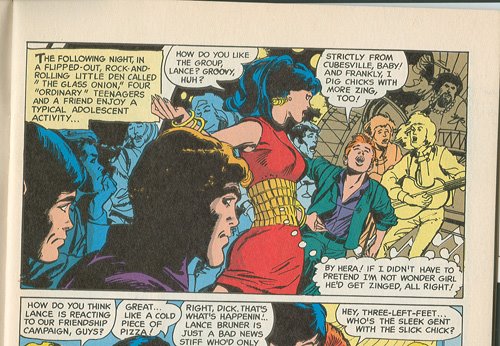
The second excerpt, of the same panel, is from The Best of the Brave and the Bold 6, on the better quality Baxter paper, I guess. Donna is now wearing a 2-color dress, red with a garish yellow middle that perhaps is supposed to now be a belt, instead of the tight knit it appears to be in the original. And Lance is now wearing a greenish suit with a purple shirt, both a more formal, non-teen-like outfit, and an even uglier color combination than the original.
I've seen this sort of thing done often, in this case and in others. I can understand if it's an improvement, but here it clearly isn't, though it does make Donna stand out even more. And yet, in the original, Dick, Wally, and Roy on the left, are in muted colors, making Donna and Lance stand out. In the revision, Dick and uh, Wally, I think it is, are fully colored, with Roy in blue shadows, and the panel doesn't feel properly blanced. I dunno. Maybe it's just me.
Gonna go find nice Roy shots to scan.
Subscribe to:
Posts (Atom)